Note: to see the source code and read a more detailed story about the project, including how to run and use the app on your computer, and potential future additions to the application, consult the README file in the project's GitHub Repository
Responsive email template and design made in JavaScript/HTML/CSS with Bootstrap framework and CSS Flexbox method
Visual Studio Code was used for code editing and Git for version control
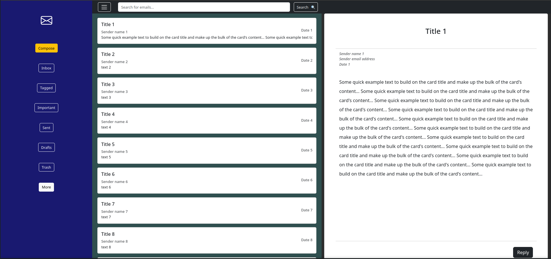
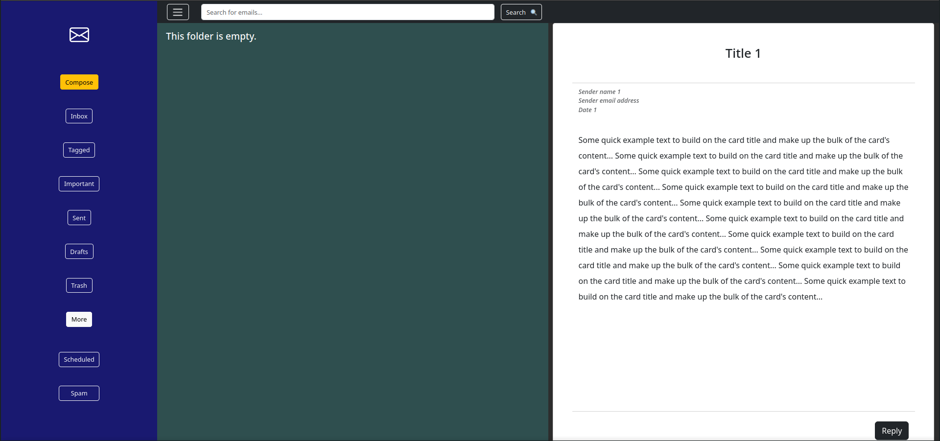
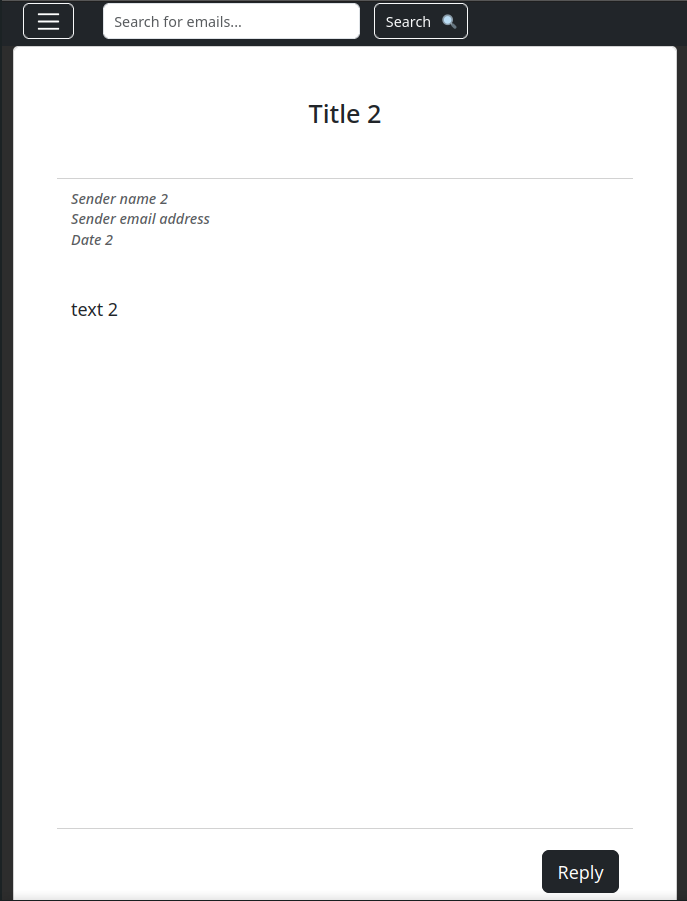
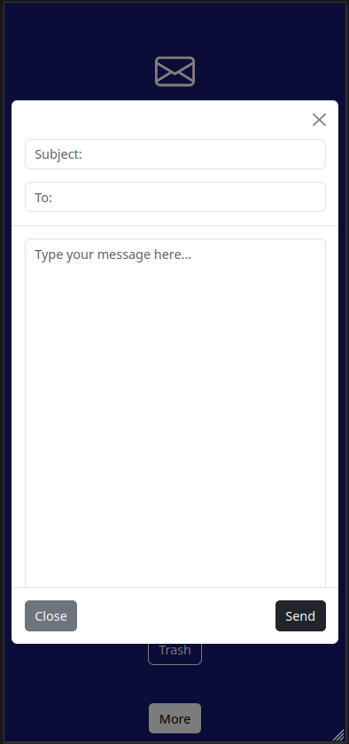
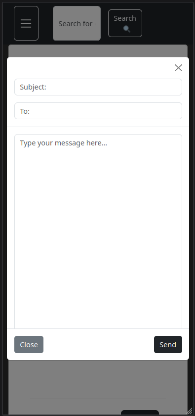
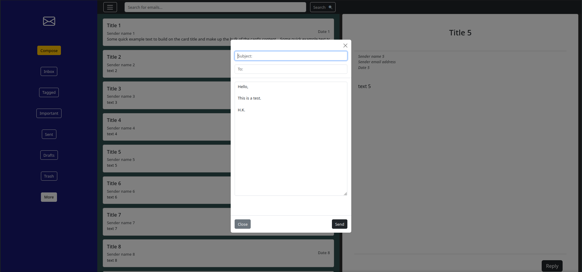
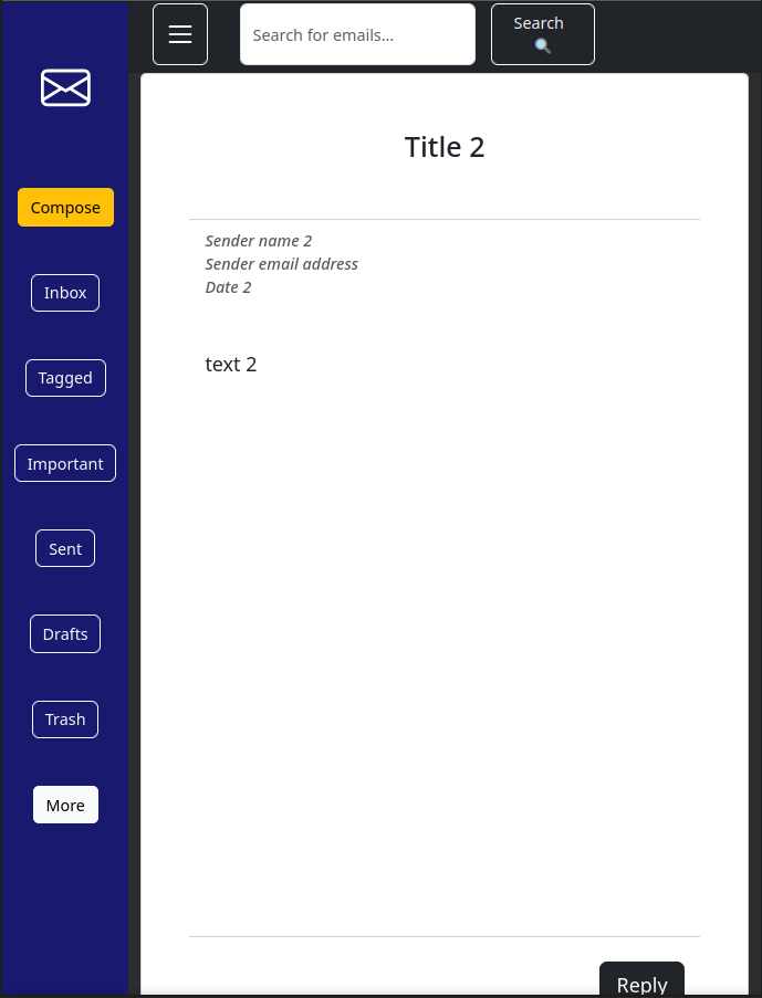
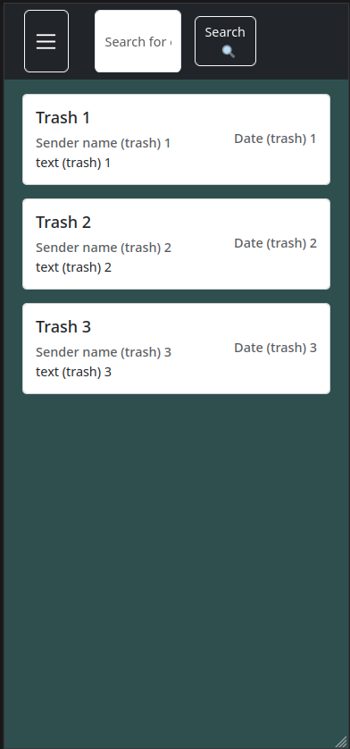
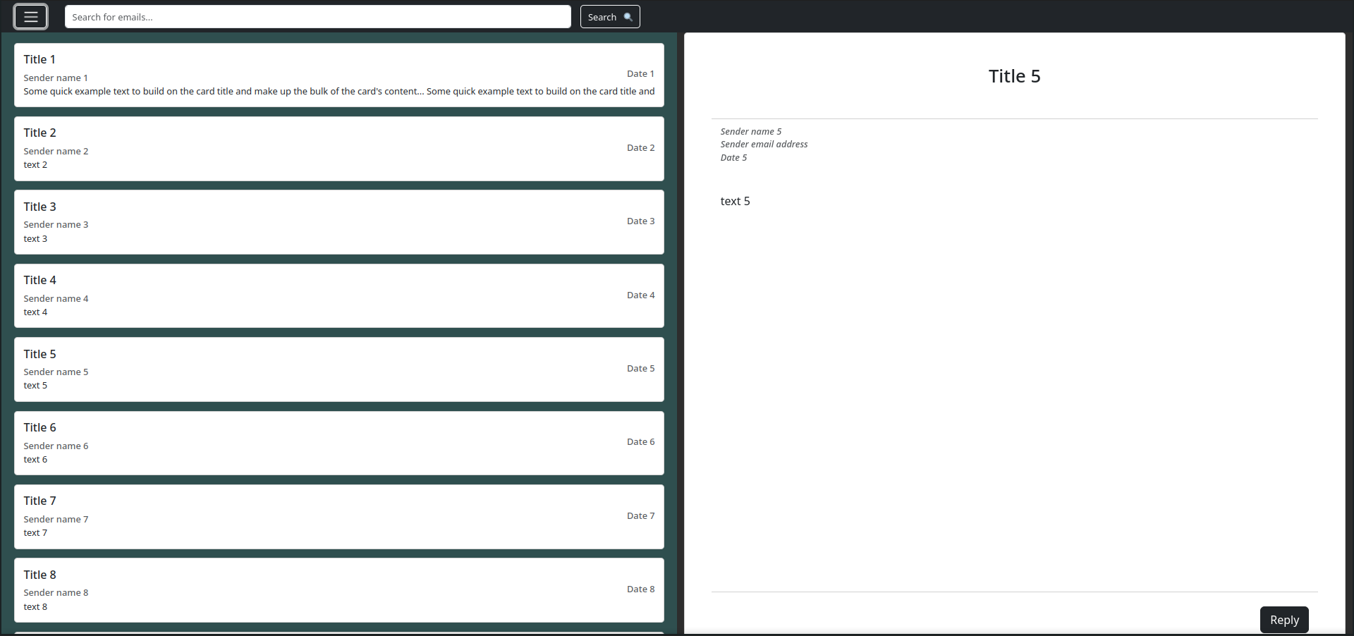
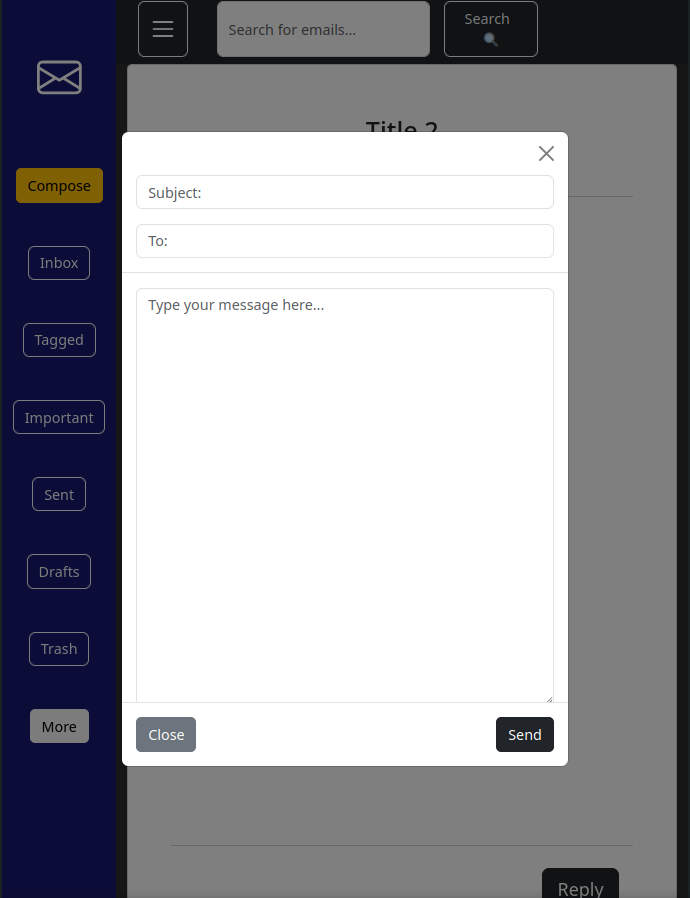
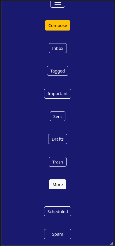
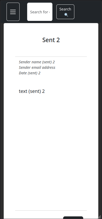
This is a front-end web email application with interactivity that allows users to browse various email message categories (in folders such as Inbox, Tagged, Drafts, etc.), write new messages with specified recipient and subject, reply to messages in each folder, toggle the vertical navigation bar, and search for messages in the search bar. All this can be done with maximum level of responsiveness to changes in screen size, and all components are vertically scrollable
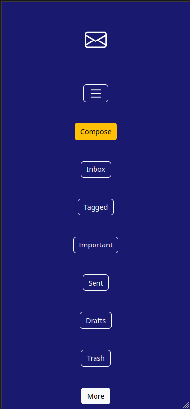
This application is entirely responsive and supports mobile device view, tablet/half screen view, and fullscreen desktop view (for PCs)
The hardest part of making the HTML code structure was to make the template fully responsive for 3 different screen sizes using Bootstrap breakpoint classes, while at the same time maintaining functionality of toggle buttons, as well as the scrollable property of message list container and main message container
Vertical navigation bar and its toggle property initially caused bugs on tablet and phone screen sizes, and it was particularly difficult to make extra small screen size (phone) template display only one container, be it message list container, main message container, or the vertical navigation bar as folder selection menu
I made this project to learn more about creating responsive webpages with Bootstrap, and also to improve my front-end development skills in JS/HTML/CSS
This project taught me how to use Bootstrap breakpoint classes to make design components responsive to screens for different devices
I also learned a lot about making user interfaces (UIs) as part of frontend development
Coming back to the project a couple months after it was finished, I realized that I can apply DRY (Don't Repeat Yourself) principle to the script.js by replacing repetitive .onclick event listener code for each button in the vertical navigation bar (for each message folder) with a more abstract single for loop that creates a click listener for all of those buttons, and opens corresponding sections for message list and message container. This optimization reduced the script file by more than 280 lines of code
The developer log I wrote while working on this project can be found here
These are wireframe images that outline the structure and functionality of the application and show its interface on each of the three different device types: